Transportation Software
Refreshing a Complex Platform Website
Tobi Cloud had 20+ pages to refresh and a client who needed it done as soon as possible. With the brand and imagery already in place, the work was to pull everything together into a cohesive, well-structured site
The Challenge
The existing site no longer reflected the platform or the direction the client was taking the brand.
- Navigation had no clear product hierarchy
- Pages were inconsistent in layout, spacing, and visual structure
- The homepage hero didn't communicate the actual product
- 20+ pages built, updated, or restructured before deadline
The Strategy
Apply the enterprise-focused messaging direction consistently across every page, keeping the tone aligned with where the platform was headed.
- Build a clear navigation hierarchy with full dropdown menus
- Design all pages in draft mode so the live site wasn't disrupted
- Apply consistent layouts, spacing, and visual patterns
- Set up SEO keyphrases, titles, and meta descriptions on every page
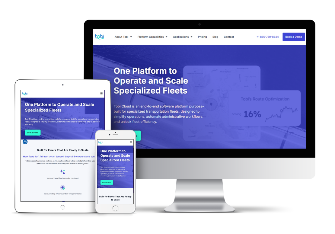
Homepage Transformation
The homepage was refreshed with a new hero image, updated section imagery, enterprise-focused messaging, and clear internal links throughout.
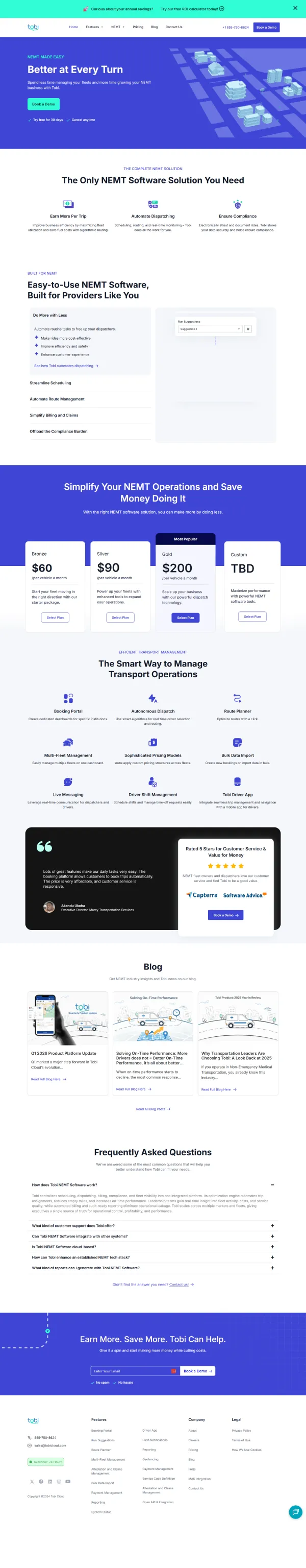
Before
Generic illustration, inconsistent layout, no clear product story.
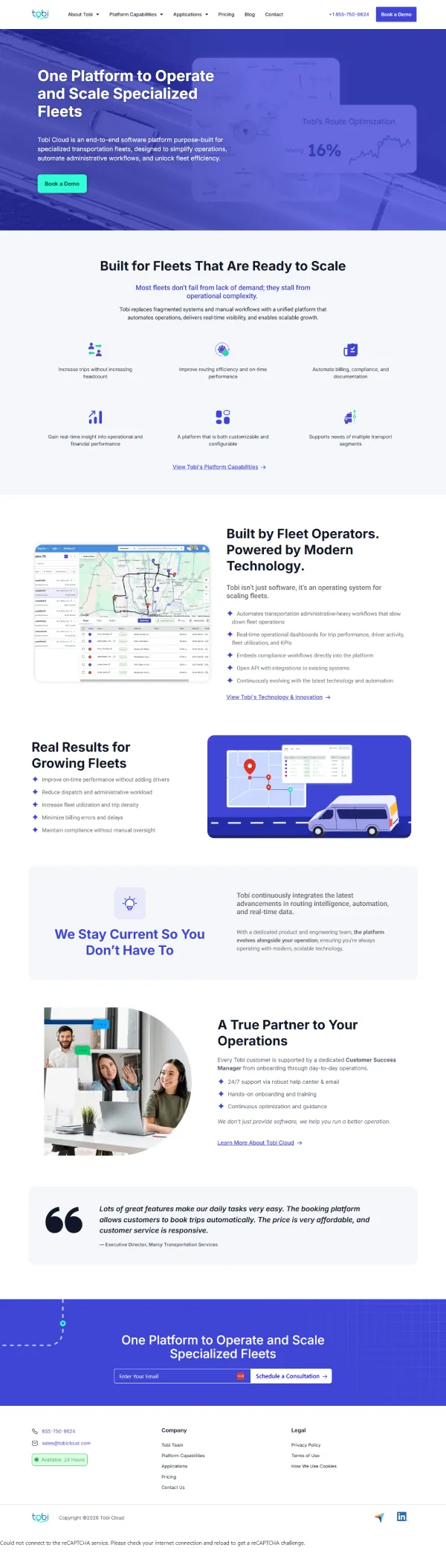
After
Bold hero image, updated imagery throughout, and a clean testimonial.
Navigation Transformation
The new navigation architecture reflects the full platform and gives every audience segment a clear entry point.
Before: What Wasn't Working
- Flat structure: No product hierarchy — everything grouped under "Features" and "NEMT."
- Single-segment focus: The nav didn't reflect the full platform or its audiences.
- Mega menu with heavy text: Dense, overwhelming dropdown that was hard to scan.
- No audience entry points: Visitors couldn't quickly find what was relevant to them.
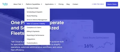
After: How It Was Improved
- Clear product hierarchy: Platform Capabilities and Applications as top-level categories with full dropdown menus.
- Simple, clean dropdowns: Easy to scan and navigate without overwhelming the visitor.
- Targeted audience entry points: NEMT, PACE, Veterans Affairs, and Student each have their own page.
- About Tobi section added dedicated team, privacy, technology, support, and FAQs.
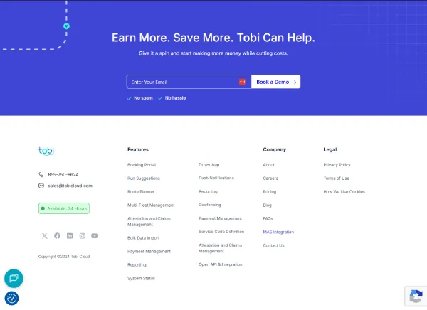
Footer Transformation
The footer was updated to reflect the new site structure and replace outdated links and messaging.
Before: What Wasn't Working
- Outdated links: The "Features" column linked to old pages that no longer existed.
- Cluttered layout: Too many links made the footer hard to scan.
- Trial-focused CTA: "Earn More. Save More." didn't match the enterprise direction.
- Confusing structure: Visitors couldn't easily find what they were looking for.
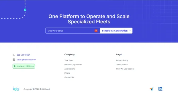
After: How It Was Improved
- Updated Company column: All links now point to the correct new pages.
- Clean, organized layout: Simplified columns make key links easy to find.
- New enterprise CTA: "One Platform to Operate and Scale Specialized Fleets / Schedule a Consultation."
- Consistent structure: Footer navigation aligned with the new site architecture throughout.
The Partnership
This project ran through a fractional marketer who managed the client relationship and created all the content. The process was built to support that dynamic with fast turnarounds, clear communication, and no bottlenecks on the execution side.
- Draft pages allowed the client to review before anything went live
- Weekly email updates kept the client informed at every stage
- Content, images, and copy were reviewed and approved in batches
- Questions and feedback were addressed quickly
- Launch day tasks were handled efficiently as a single coordinated effort
- The site went live without the client needing to manage any of the technical details
Building a Better Experience
An updated layout and navigation brought consistency, clarity, and scalability across the full site.
New Navigation Architecture
Platform Capabilities and Applications replaced the old flat nav — giving every audience segment its own clear entry point.
SEO Ready at Launch
Every page launched with a unique keyphrase, SEO title, and meta description already in place.
Consistent Page Design
20+ pages built with consistent layouts, spacing, and visual patterns throughout.
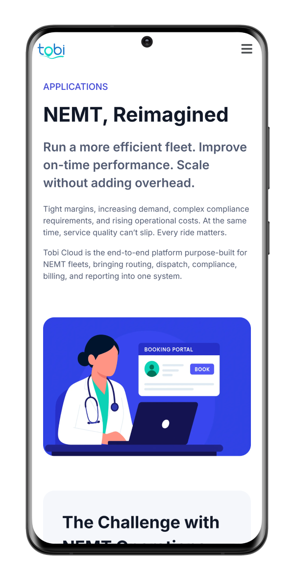
Mobile Friendly
All pages reviewed and tested across desktop and mobile before launch.
A Website Ready to Scale
Ready for What's Next
Structured and organized so the site can grow as the platform does.
Built for Multiple Audiences
A new navigation architecture gives every segment a clear path through the platform.
SEO Ready from Day One
Every page launched with a keyphrase, title, and meta description already in place.