Financial Services
Building Trust With a Clear, Professional Website
Fusion Asset Management needed a clearer, more consistent website. The redesign applied new branding, reorganized layouts, and improved content structure to deliver a polished, user‑friendly experience.
The Challenge
Fusion’s website wasn’t helping them build trust. Visitors struggled to understand what they did and how to get the information they needed.
- The layout felt outdated.
- Pages looked inconsistent.
- Important details were hard to find.
The Strategy
The focus was on the changes that would make the biggest difference without rebuilding the entire site.
- Clearer messaging throughout the site.
- Cleaner, easier‑to‑read pages.
- A simple structure the team can update on their own.
The Partnership
Clear communication and ongoing support were at the center of this project
Fusion never had to guess what was happening or worry about being left on their own. The process was built around clarity, collaboration, and steady progress.
- Key pages were reviewed together so decisions were quick and confident.
- Regular updates kept the project moving smoothly.
Support didn’t end at launch. A simple “How‑To” guide was added inside WordPress so the team can manage their site anytime.
- The team can update content without worrying about breaking layouts.
- The site is built to grow with the business, not lock them into ongoing dependency.
Building a Better Experience
A simple, flexible design system now keeps the site clear, consistent, and easy to maintain.
Consistent Layouts
Pages now look unified and professional across the entire site.
Easy to Update
The team can make changes without worrying about breaking anything.
Polished Look
Clean spacing and consistent styles make the site feel more trustworthy.
Mobile Friendly
Everything works smoothly on phones and tablets.
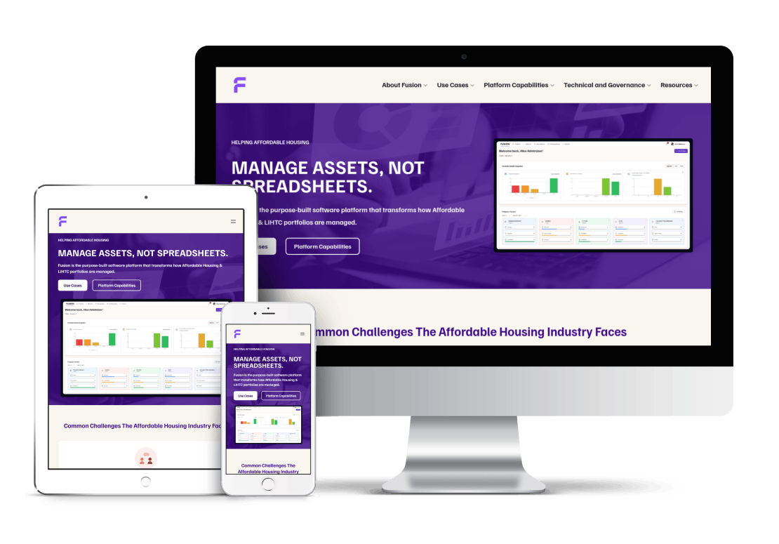
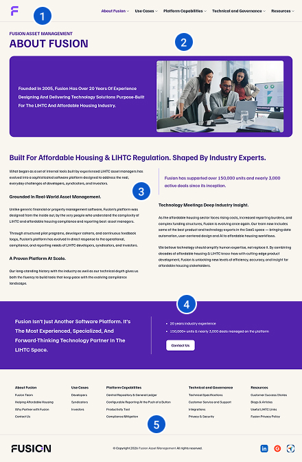
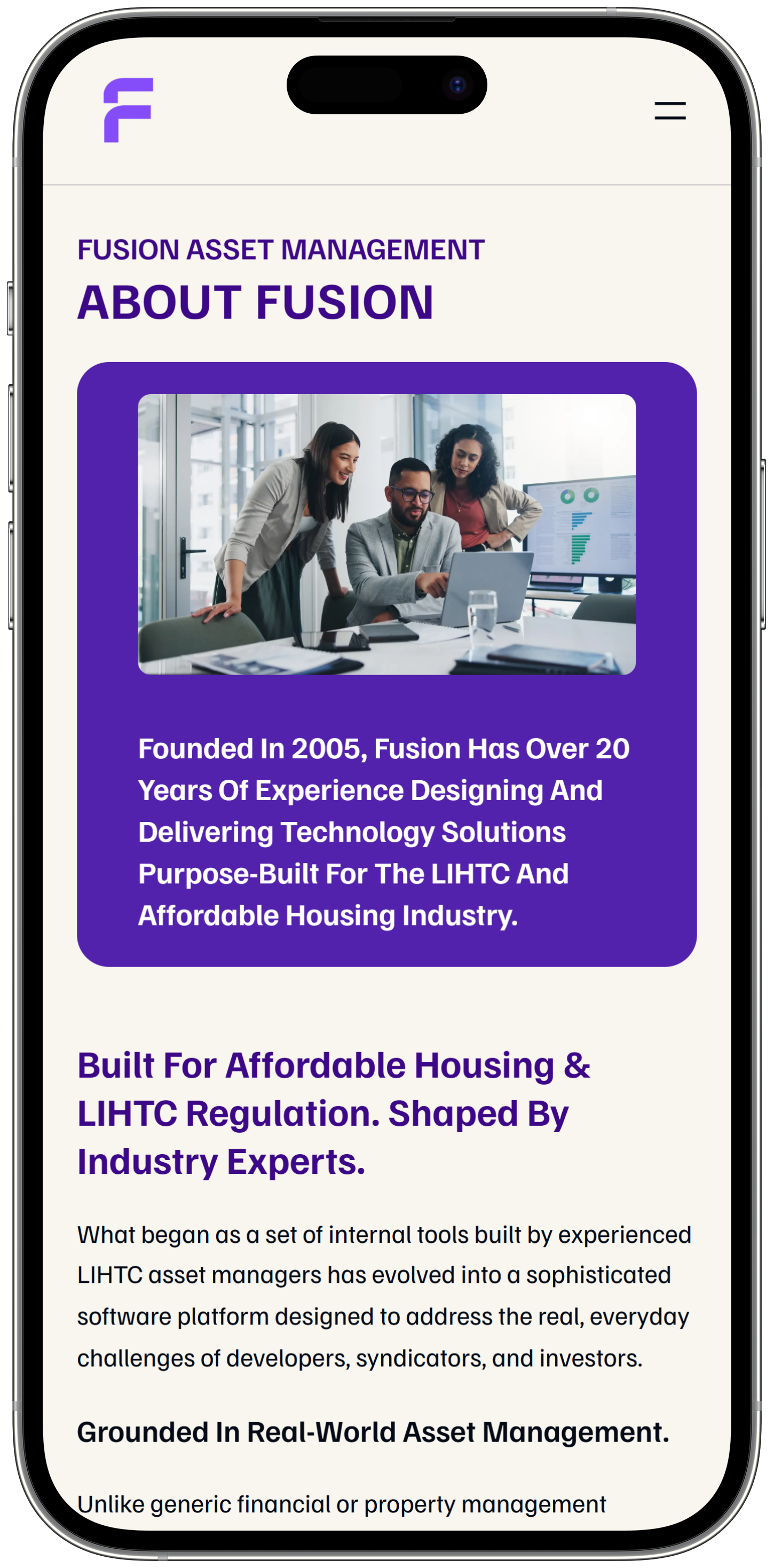
Homepage Transformation
The homepage was reorganized to communicate Fusion’s value more clearly and guide visitors through the content with confidence.
Before
Crowded, hard to scan, and unclear.
After
A clear message, simple layout, and obvious next steps.
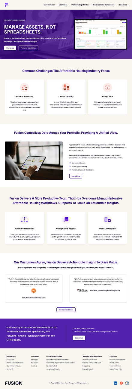
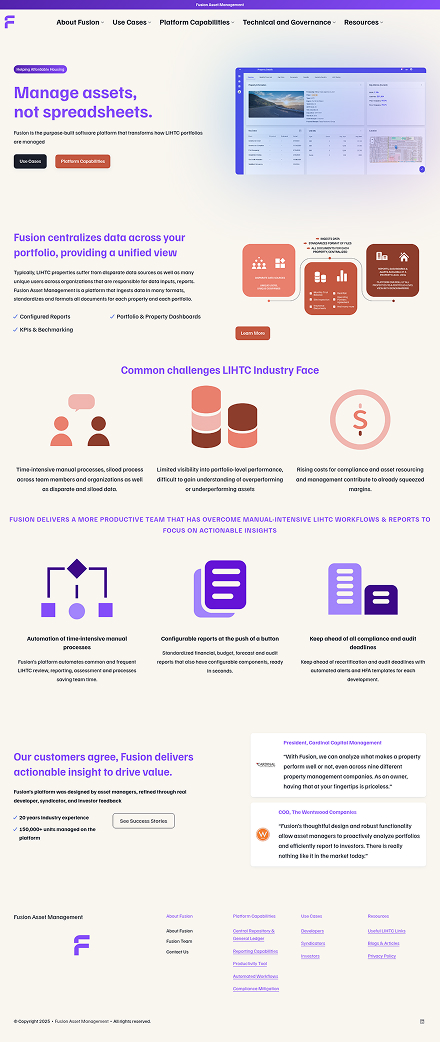
Pages Transformation
After the homepage set the direction, the same clarity and structure were applied across the rest of the site.
Before: What Wasn’t Working
The original pages had issues that made the site feel less polished than Fusion’s actual work.
- 1. Hard to navigate: Visitors weren’t sure where to go next.
- 2. Unclear page titles: It wasn’t obvious what each page covered.
- 3. Overwhelming text: Long lines made reading difficult.
- 4. Inconsistent spacing: Content felt crowded and uneven.
- 5. Buried links: Important information was hard to find.
- 6. Low readability: Some colors made text harder to read.
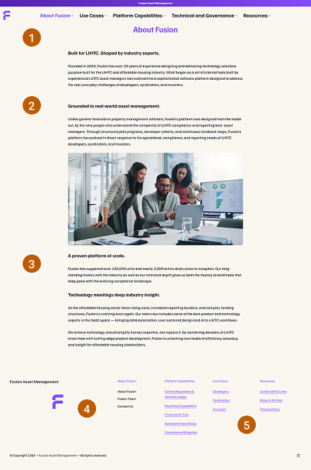
After: How It Was Improved
Updates focused on clarity, readability, and a more cohesive experience.
- 1. Clear navigation: Visitors can now easily see where they are.
- 2. Easier reading: Text is more comfortable to skim and understand.
- 3. Cleaner layouts: Spacing is consistent and organized.
- 4. Helpful calls‑to‑action: Buttons appear at natural decision points.
- 5. Organized footer: Key links and contact details are easy to find.
- 6. More readable colors: The palette supports better accessibility.
Modular Scalability
Reusable sections make it easy for the team to add new content without losing consistency.
A Website That Works
Stronger First Impression
The site now reflects the quality of Fusion’s work.
Easier for Visitors
Information is simple to find and understand.
Smart Investment
Strategic updates created a big improvement without a full rebuild.
Audible WOW
"I worked with Kirsten and Orange Owl Design to improve the aesthetic of a newly launched website for my client. Kirsten was efficient, fast and the website design speaks for itself. My clients gave an audible WOW when reviewing it. I expect to work with Orange Owl Design again."

Deborah Lucas
Marketing Lead