Pet Care & Animal Wellness
Refreshing the Online Presence for a Local Pet Rehab Center
How a thoughtful website redesign helped a trusted rehab clinic connect better with pet owners.
Summary
The Canine & Feline Rehabilitation and Conditioning Center had a website that didn’t reflect their expertise or compassionate care. It looked dated, was tricky to navigate, and wasn’t helping pet owners find the information they needed.
Orange Owl worked directly with the clinic’s owner to create a modern, mobile‑friendly site that feels calm, trustworthy, and easy to use. The new website makes it simple for pet owners to find services, learn what to expect, and reach out for care.
Client Background
The Canine & Feline Rehabilitation and Conditioning Center offers specialized rehab and conditioning for dogs and cats recovering from surgery, injury, or mobility issues. They combine hands‑on, in‑clinic therapy with at‑home exercises, so clients can continue treatment between visits.
The owner’s main goal was for local pet owners to be able to find her online and quickly see what makes her rehab services different from other facilities.
The Challenge
The previous website was holding the clinic back in a few key ways:
- Outdated design: The look and feel didn’t match the clinic’s high standard of care, which could make new visitors question its professionalism.
- Hard to navigate: Important details like treatments, staff information, and contact options were buried or unclear.
- Low engagement: There were few clear next steps and not enough testimonials or success stories to build trust and encourage contact.
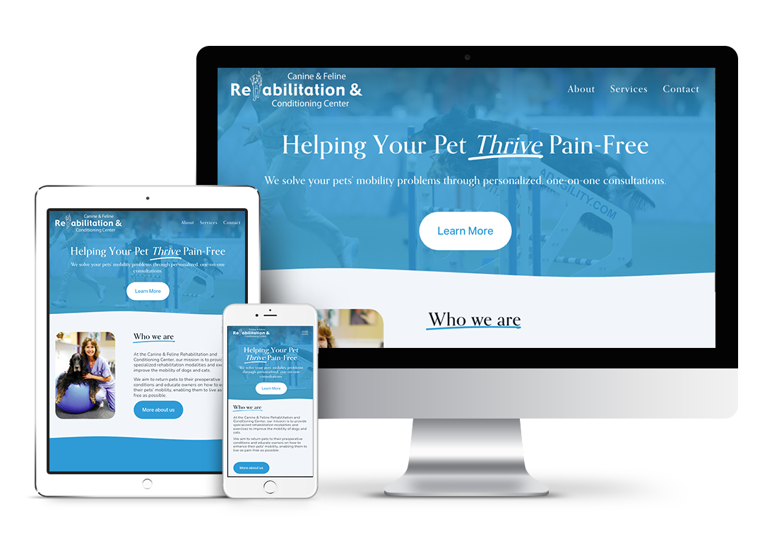
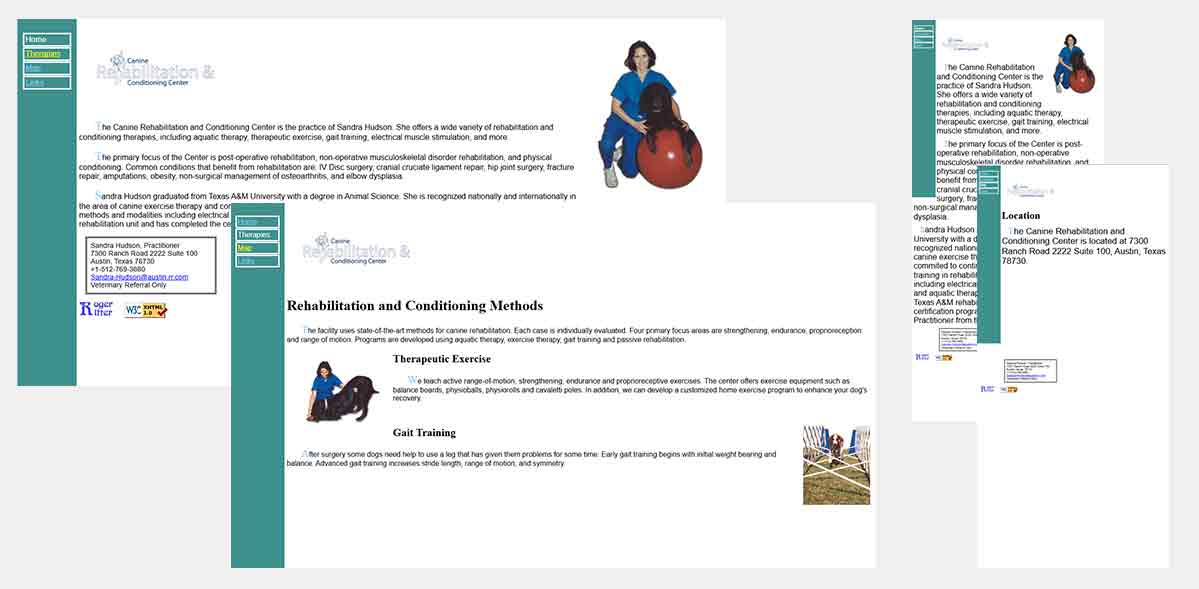 Old homepage lacked clear hierarchy and calls to action.
The Approach
A short branding survey helped to understand the owner’s goals, preferences, and how she talks about her work. Together, we used that to shape the site’s look, structure, and messaging.
- Brand Identity: She wanted a classic, “essential care” feel rather than something flashy or trendy, so the design stays simple and focused on clarity.
- Visual direction: We chose a blue‑and‑white palette for a calm, clinical feel, and paired a friendly sans‑serif (Nunito) with an elegant serif (Orpheus Pro) for headings.
- Content strategy: We centered the site around clear service descriptions, real photos, and copy that explains both in‑clinic and at‑home therapy in plain language.
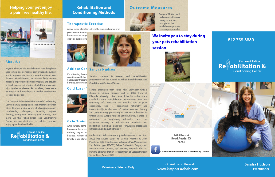 Original brochure content provided the base for the website copy.
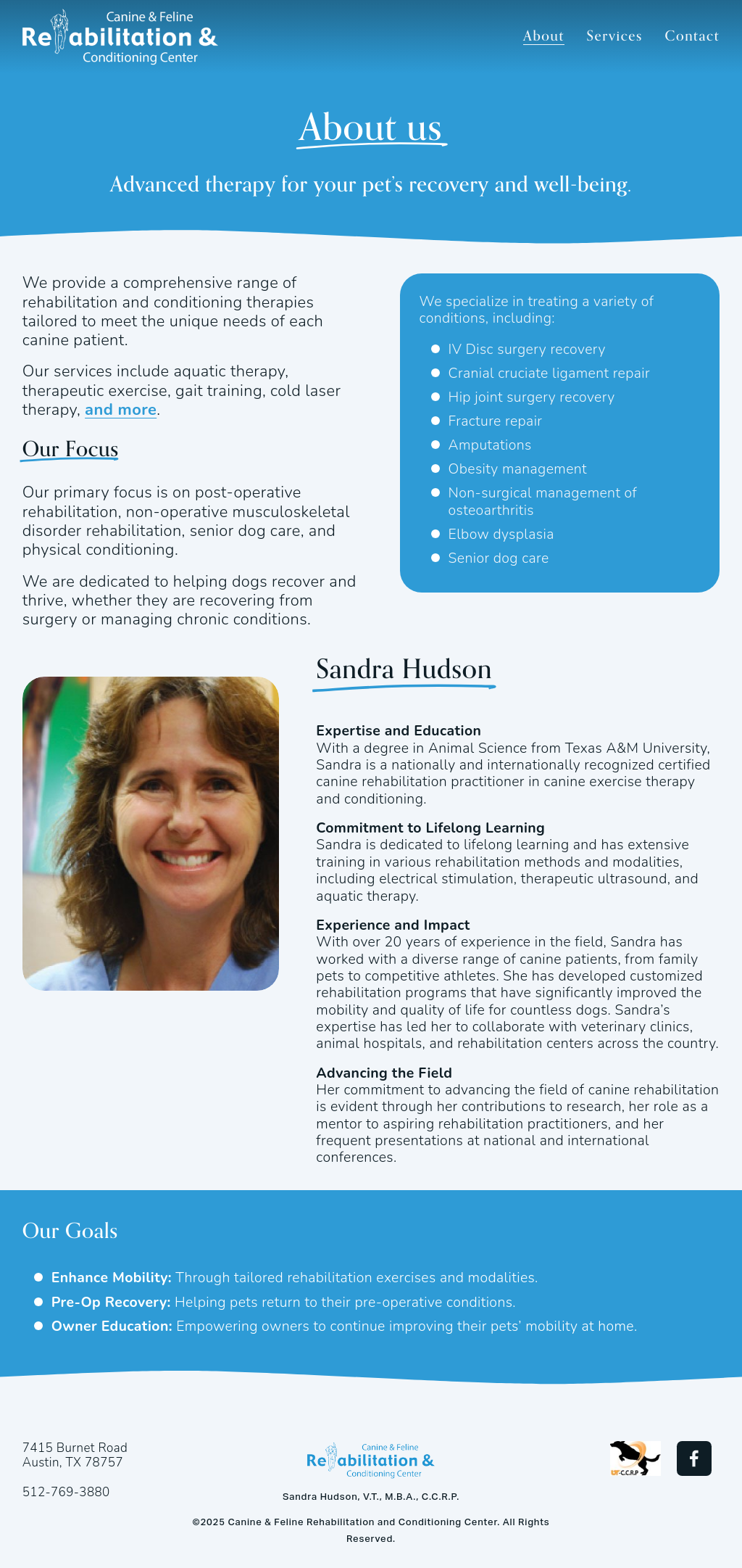
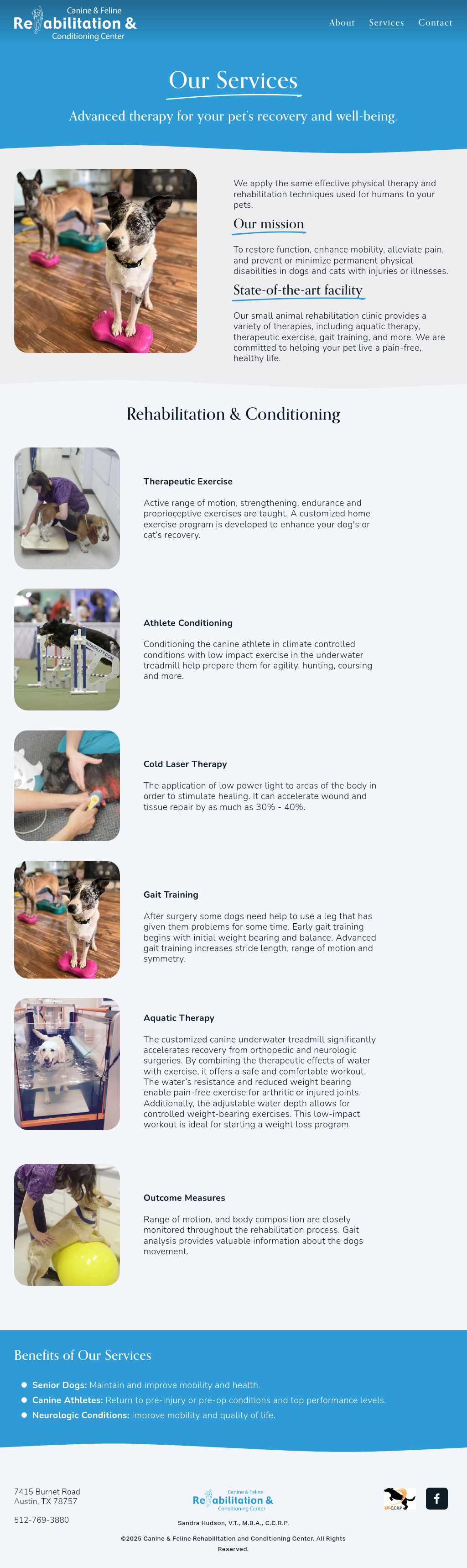
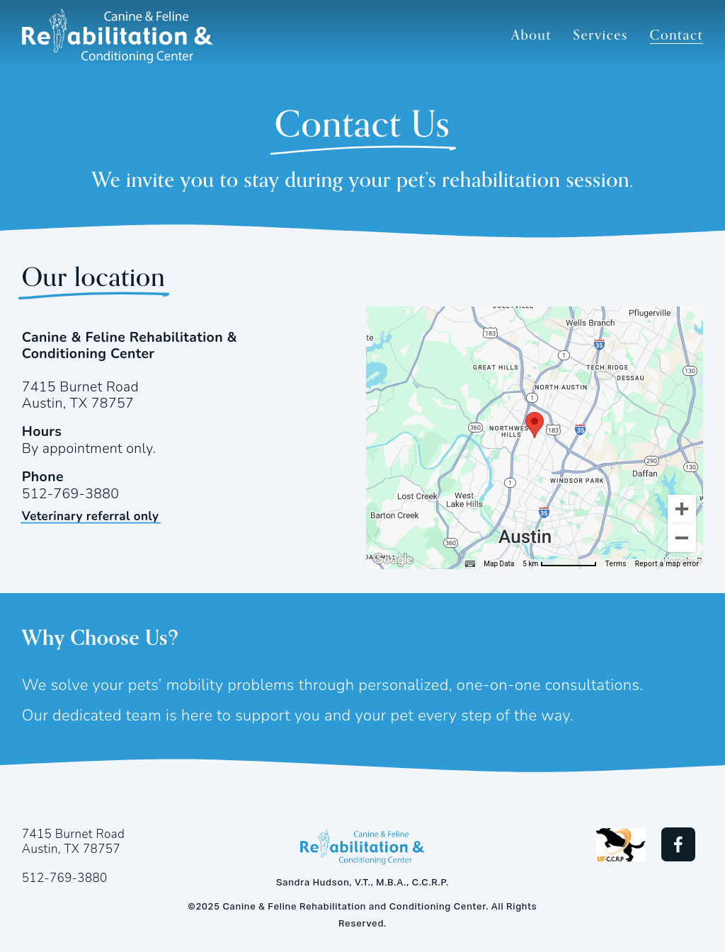
Solution
- Visual Design Clean, calming layout using the chosen color palette, plenty of white space, and a clear type hierarchy so content is easy to read at a glance.
- Navigation & UX The site structure was simplified so visitors can quickly move between treatments, staff bios, FAQs, and contact options without feeling lost. The design is fully responsive, so pet owners have a smooth experience on phones, tablets, and desktops.
- Content & Messaging Service descriptions were rewritten to focus on plain, benefit‑driven language that answers common questions (“What is this?” “Is it right for my pet?” “What happens next?”). I used AI tools as a helper to refine copy for clarity and to adapt longer brochure text into scannable web content.
- Trust Builders Testimonials and real patient stories were added throughout the site to show outcomes and reassure new clients that their pets are in good hands.
- Branding Assets Created light and dark logo versions and a matching favicon so the clinic’s brand looks consistent across the site and other digital touchpoints.
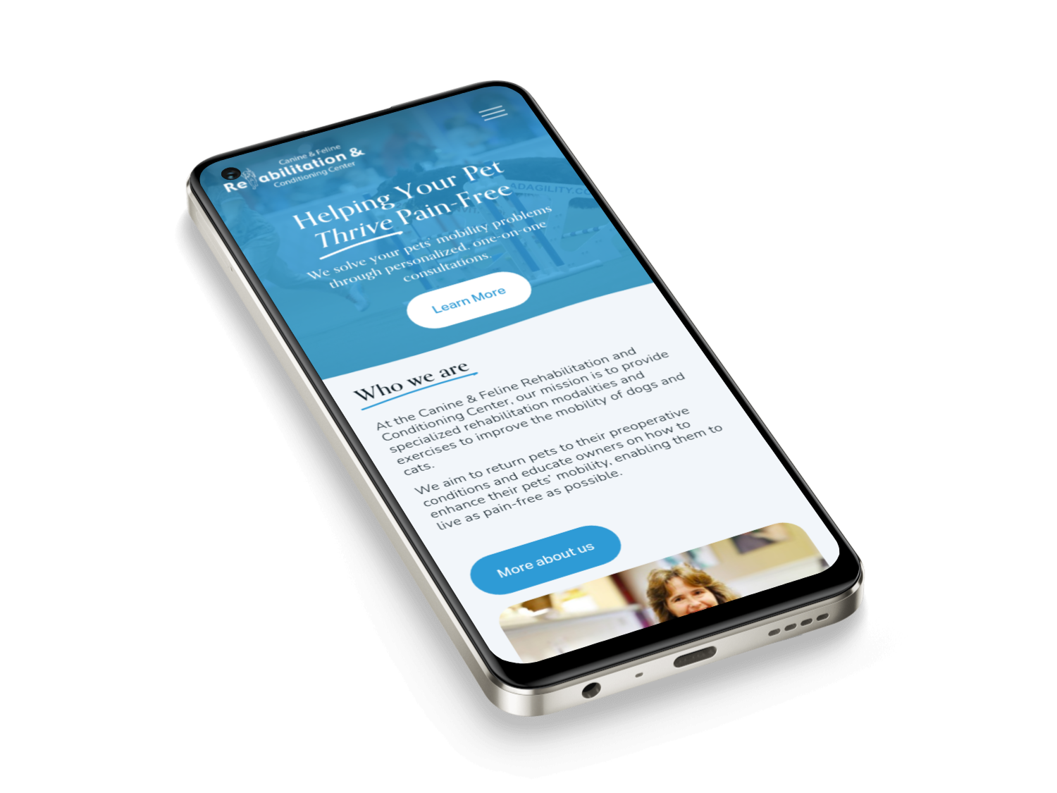 New mobile layout makes it easier for busy pet owners to get information and contact the clinic.
Visual Design
Calming, clean layout with a fresh color palette, real pet imagery, and clear typography for easy reading.
Content Strategy
Clarified services and rewrote copy in concise, benefit‑focused language that speaks directly to pet owners.
Navigation & UX
Streamlined the site structure so visitors can quickly find treatments, staff bios, FAQs, and contact details.
Trust Builders
Wove testimonials and success stories into key pages to highlight real results and build credibility.
Discovery & Brand Direction
To align the site with the owner’s vision, I started with a short branding survey covering colors, tone, and goals for the website.
Preferred Colors
"Blue and white" — calming, clinical, trustworthy.
This confirmed the direction for the color palette: cool tones with plenty of white space.
Typography
Headings: Orpheus Pro
Body: Nunito, 18px base size
Style: Friendly, modern sans-serif for content; elegant serif for headings
Hierarchy: Guides eyes naturally through content.
Website Purpose
"Be able to find me, able to see what makes me unique to other rehabilitation practitioners."
How would you describe your brand to a friend?
"Provide both in-clinic rehabilitation and teach clients exercises to continue therapy at home."
This shaped both the navigation structure and content strategy emphasizing clear service info, authentic photos, and personalized copy.
Visual Style Preferences
Rated a 2 (leaning classic)
Rated a 1 (strongly necessity)
- A professional, understated layout and not overly trendy
- Function-first design focused on clarity and usability.
- Messaging that emphasizes essential care over indulgence
Results
The redesign turned an outdated, text‑heavy website into a modern, friendly, and easy‑to‑use experience that finally matches the quality of care the clinic provides. Pet owners can now quickly understand the services, get to know the team, and contact the clinic from any device without frustration.
While we didn’t track formal metrics, the site now better reflects the owner’s brand, supports her conversations with new clients, and serves as a flexible foundation she can grow with over time.
New design for K9SportsRehab.com